Shades of 15c BMA - Blue, Blue-er, Blue-est
With the plethora of shades and possibilities of changelings, the BMA series overprinted on stamps of Straits Settlements is a favourite that stands really close to heart. Previously, I have covered on shades of the 10c, however, that remains a tip of the ever-so colorful iceberg.
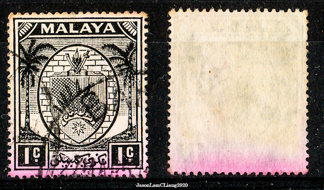
 |
| 15c Ultramarine (R) on substitute paper |
The shades of this denomination is a spectrum from blue to ultramarine - a lot less scarier than that of 10c's. For this, I am referring to the shades listed on both ISC catalogue and KGVI Postage Stamp catalogue by Murray Payne referred to as ISC and CW accordingly.
 |
| Although both catalogues do list the same shades, there are certain shades notably 'Bright Blue', 'Dull Ultramarine', and 'Steel Blue' that were not mentioned in the one of the other catalogue. |
According to the comparison between these two catalogues, it is safe to assume that Ultramarine and Bright Ultramarine are of the same shade, in reference to the 'spectrum' with regards to the 15c stamp. That aside, there is an additional shade known as 'Steel Blue', which is somewhat dark blue and the only shade that I am missing.
The scans here are compared with Ultramarine as the control, or conserved reference for other shades.
 |
| Left: Dull Ultramarine, ordinary/substitute paper Right: Ultramarine/Bright Ultramarine, ordinary/substitute paper |
 |
| Left: Blue, chalky paper Right: Ultramarine/Bright Ultramarine, ordinary/substitute paper |
 |
| Left: Ultramarine/Bright Ultramarine (B), substitute paper(?) Right: Ultramarine/Bright Ultramarine, ordinary/substitute paper |
 |
| Left: Ultramarine/Bright Ultramarine, chalky paper Right: Ultramarine/Bright Ultramarine, ordinary/substitute paper |
The shades of 15c tend to appear brighter on chalky paper due to the nature of the paper. The print is far sharper, 'crispy' as some would call it.
The paper types for 15c are either substitute paper or chalky paper. That was the case up until I took a closer look at the 15c with the black BMA overprint, which seemingly looked like it was on chalky paper but in fact printed on another type of substituted paper.
The following are some examples of paper types of the 15c taken at x60 magnification:
 |
| Chalky paper; this is the usual type seen. |
 |
| Chalky paper; this is also usually seen. Note on the visible pits and very faint fibers. |
 |
| Chalky paper; pits occur at a higher number. This was printed pre-war. |
 |
| Ordinary paper; this is the usual type seen. |
 |
| Ordinary paper; this type has more fibers seen somewhat similar to that of rough paper and striated paper but not to that extent. |
15c has been more forgiving and much more exciting. I have yet to acquire the Steel Blue shade, I have seen it being listed at USD8, however, being tight on money I guess it can wait.
This is the end of this page, but definitely not the end of the journey. As I dive my tweezers into boxes of stamps, there has got to be more of that 15c waiting. Hence, I will update, if any, in this write up.
Thanks for dropping by!
Update:
After some time, I was finally able to assemble somewhat of a complete series of shades for this denomination.


After some time, I was finally able to assemble somewhat of a complete series of shades for this denomination.
Although I have all the listed shades, it is far from a true complete set since I have yet to acquire mint copies for some of the shades. Unsure of what I was looking at, I bought some stamps from KGVI stamps (Tom Cusick) as color control.


In addition to CW39d, I found a few duplicates of ultramarines that were on chalk paper, and brighter than what I got. The local (Malaysian) catalogue by International Stamp & coin did mention a bright ultramarine version in chalk. Could that be it? It could. It could also not, depending on what color key each catalogue is referring from.
Interestingly, CW39d which is supposed to be on chalk paper had characteristics of a substitute paper when examined.
 |
| This is a CW39d that I purchased. Notice that the ink does not spread similar to how they should on chalk paper. This is a substitute paper. However, compared to CW39, this is much brighter, which gives the impression that a 'Bright Ultramarine' from ISC is an actual separate shade. |
 |
| This is a CW39d that I initially had and is no doubt on chalk paper. |
Now comes another conundrum, assuming that ISC is using the same color keys as Stanley Gibbons' since the catalogue numbers are the same, is there truly a Bright Ultramarine on Substitute Paper?
I will never know unless I have completed this series with MNH stamps.
Thanks for dropping by this update!


Comments
Post a Comment