Posts

Tigers of the Federated Malay States 1

Image
Established by the British Government in 1896, the Federated Malay States (FMS) comprised of four independent Malay states: Selangor, Negri Sembilan (Negeri Sembilan), Pahang, and Perak with Kuala Lumpur as the designated administrative capital. The flag of the FMS consisted of stripes of white, red, yellow, and black from top to bottom - in the same order as mentioned - with a leaping Malayan Tiger in the middle. The stripes represented all the states of FMS.  The reason of merging these four protected states mostly, if not, majorly gravitate around the need to secure, safeguard, and strengthen commercial interests. Local administrators strongly opted for the establishment of FMS since their economic motives could be quickly realized. Going deeper into this subject would result in writing (and ranting) more hence let me just quote a few references used at the end of this post.  Flag of the FMS This article will feature just the earlier issues (1891 or 1892) of leaping tigers in these
The General Issue of the Malayan Federation: Interesting finds on Varieties.

Image
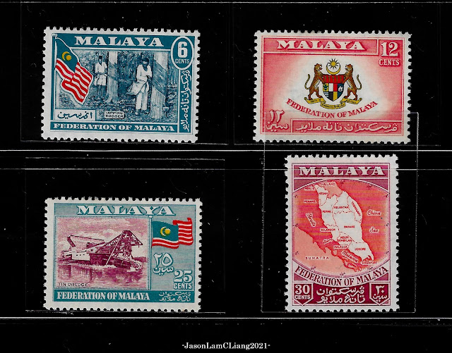
The general issue of the Malayan Federation are four denominations: 6c, 12c, 25c and 30c that are all multicolored issued on 5th May 1957.  General Issue of Malayan Federation Clockwise from the top left, they are listed as ISC 1-4. In the same catalogue, varieties are majorly colors with the exception for 12c, which I have yet to come across.  Known varieties and shades of the 1957 General Issue.  On the first row are three known shades of the 6c: i. Deep-blue, red, yellow, & grey-blue (ISC1); ii. Indigo, red, yellow, & grey-blue (ISC1b); and iii. Indigo, red, yellow, & slate-blue (ISC1c). On the second row, somewhat interesting, yet unconfirmed is what I believe to be an offset of the red dye on the gum.  Nothing peculiar on the 12c of the third row, that is just a normal piece. Next to it is an irregularity of the 25c, in which it should have appear in shades of maroon just like the three stamps arranged on the fourth row. It seems to be a shade of mauve to violet (?). 

Shades of North Borneo stamps of 1954-1957

Image
As listed on ISC, there are several notable shades for some denominations (well, there are just 6 to be honest). Since I do not own any specialized catalogues for North Borneo, I guess the references listed on ISC would do just for now.  An overview of all the listed shades 1 cent Red-brown (left) and Lake-brown (right) The 1 cent Red-brown (listed as ISC336) appears with a reddish to rosy-looking sky while the Lake-brown (listed as ISC336a) has a flat brown look. The foliage in the foreground of ISC336a appears brighter. Generally, the features of both Mount Kinabalu and its foreground are more visible.  3 cents Green (left) and Deep Green (right) The 3 cents Deep Green (listed as ISC338a) appears more intense compared to the 3 cents Green (ISC338). ISC338 definitely looks grainier while ISc338 appears to have a smoother look - compare the portraits of Queen Elizabeth II. In person, it is fairly easy to distinguish between the two.  15 cents Bright blue (left) and Pale blue (right) Th

Einar Holboll's Danish Christmas

Image
Christmas falls on 25th December worldwide but the spirit of giving spans almost the entire month, and perhaps even longer in some parts of the world as I was told. Christmas, as popularized by mainstream media, plays out with snow falling, jingling bells, a warm fireplace, and wrapped presents under a decorated tree - the good kind of Christmas in family movies. Relatives and close friends that are far away are reached through mails and postcards sent throughout the season. And as stamps were affixed onto mailed letters and postcards, a Danish postal clerk,  Einar Holbøll, thought it would be better to incorporate additional stamps to raise fund for charity.  Einar Holbøll; portrait obtained from Seal Society Holbøll worked as a clerk at the post office. He had long been interested in philanthropic work and thought to himself, "If we could only catch people while they are in this holiday mood and filled with kind sentiments, I am sure that they would buy a charity stamp to be put

Revisiting Agro-Based Products

Image
Agro-based product definitives were issued in 25 October 1986 in all states of Malaysia featuring a set of seven stamps depicting agricultural products: Coffee, Coconut, Cocoa, Black Pepper, Rubber, Oil Palm, and Rice. Throughout the years, these stamps ran from sheet 1A to 14A, signifying the massive reprints as definitive stamps before it was eventually replaced by the new state definitives issued in 2007.  Initially, the Agro-based state definitive stamps were lithographically printed on SPM watermarked phosphor coated paper with a perforation of 11.75 (listed as 12 in both Scott and Stanley Gibbons). Each state shared a similar design type except the state name, emblem/ coat of arms, and portraits of respective rulers.  Perlis 20c, P. 11.75 Reprints, later on, had more interesting changes to perforation, watermark, gum, and denomination. Varieties in perforation always the easiest to distinguish, at times, even without a perforation gauge. I have had no luck with finding an unwater

Sudan Military Telegraph Stamps

Image
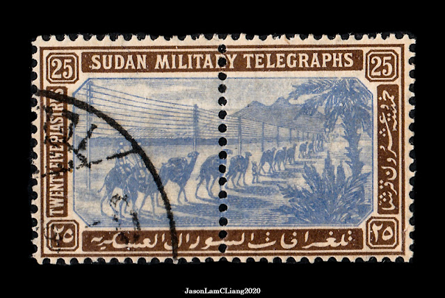
The Camel Corps Military Telegraph stamps were released in 1898 for telegraphic purposes until 1901 between towns in Sudan. On the stamp is the Camel Corps of the Sudan Defence Force marching through the desert with telegraph lines depicted in the background. The Camel Corps was established by the Egyptian army in 1883; it was then reformed again in 1884 for the Gordon Relief Expedition.  For this issue, telegraph stamps were bisected in the middle with a central perforation for the ease of separating the telegraph and its receipt. Not an error, rather for convenience. When separated, sender would receive the telegraph receipt with half portion of the stamp affixed while the post office keeps the other half attached to the telegraph form. It is an interesting find because it is very creative considering that the top half of telegraph forms used then was the receipt. Some time ago I came across just that example commented by Dave on Stampboards in 2019, which provided a visual explanat

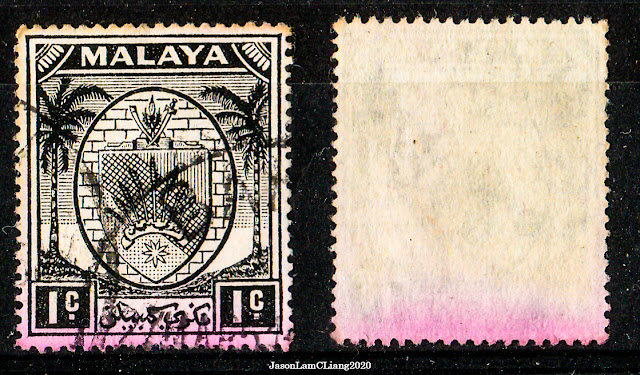
Fugitive Ink: Don't soak the purple ones!

Image
The conventional method of removing stamps off paper is by soaking in lukewarm water. However, there are certain stamps that should stay far from the soak-in-a-bulk technique especially those that were printed with fugitive ink .  Fugitive ink wash off when exposed to water or any organic solvent such as spirits, which will stain the stamps and other unlucky stamps too that soaking together. Thomas De La Rue & Co., a firm based in London is quite well-known in terms of the usage of fugitive inks especially shades of purple to magenta and green. The nature of fugitive ink, I believe, is solely to combat the issue of reusing stamps by removal of postmarks. From all the gentle scrubbing while removing postmarks, one could potentially smudge the entire stamp in purple or green. With that, it is important to have knowledge of which printing firm responsible for any said stamp prior to soaking. If not, separate the purple and green ones for careful removal and to avoid the washed off ink